Everyday money
Reports and charts
See where the money came from and went, how your spending trends, and how your money health is tracking. Export transactions to CSV.
Reports is in the sidebar under Planning. It shows income, spending and net worth for any stretch of time, with charts to dig into. A few more charts live on the dashboard and the forecast.
Choosing what to look at#
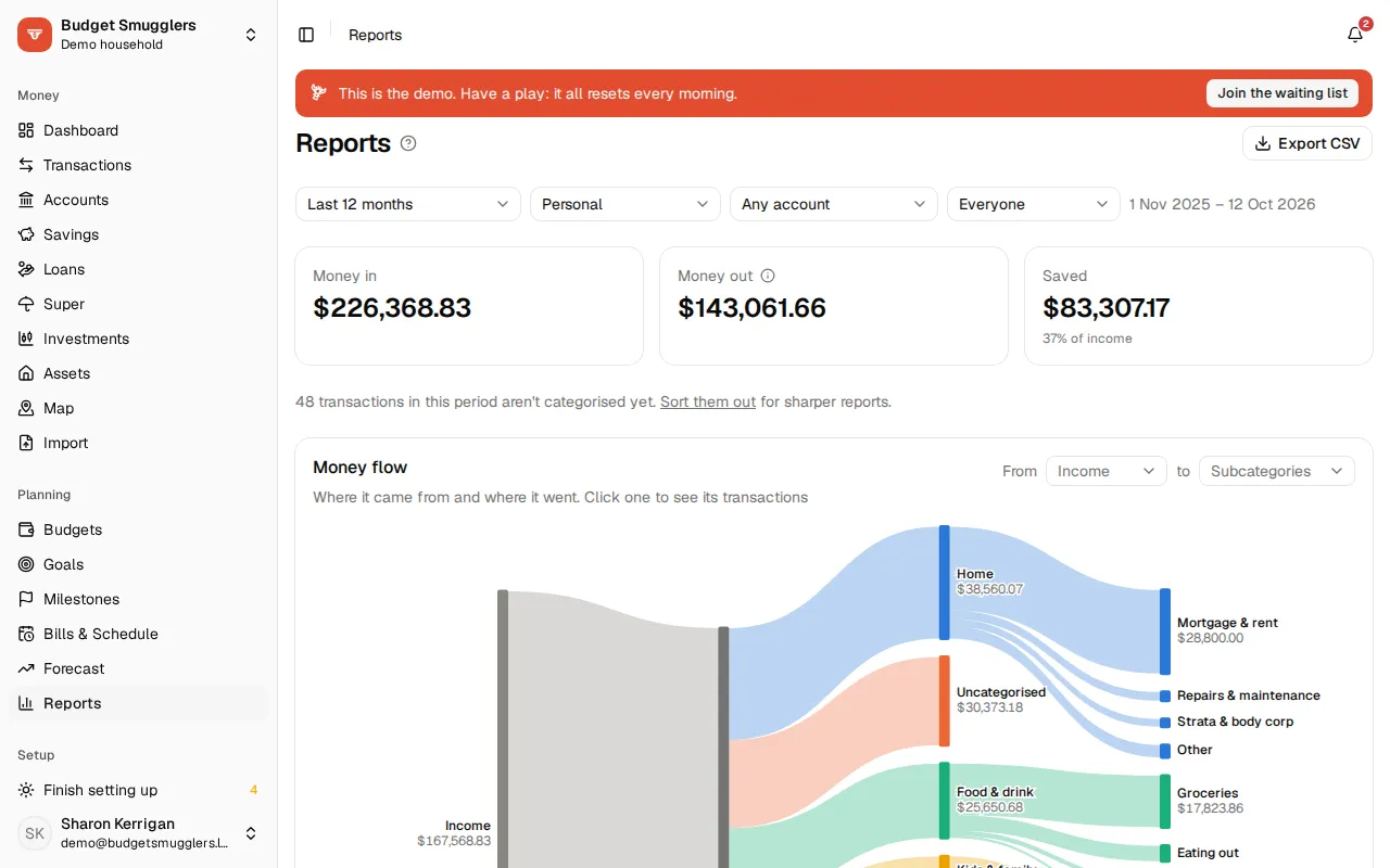
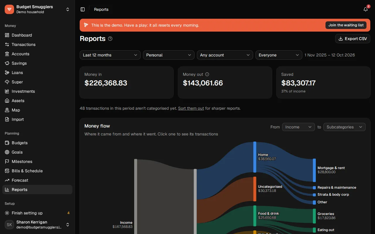
The bar across the top sets what every chart on the page shows:
- Period: this month, last month, last 3 months, this or last financial year, the last 12 months, or Custom dates. The default is the last 12 months.
- Scope: personal, all accounts or a business, if your pool has one. See Businesses.
- Account: one account, or all of them.
- Person: everyone, one person’s share, or what’s Shared. This appears once your pool has people.
The financial year follows your pool’s settings.
The summary#
Three figures sit at the top:
- Money in: income for the period.
- Money out: spending for the period. Transfers between your own accounts aren’t counted.
- Saved or Overspent: the difference, and what share of income it is.
If some transactions in the period aren’t categorised yet, a line says how many, with a link to sort them out. See Categories and rules.
The charts#
Money flow#
Where the money came from and where it went, from income on one side to spending on the other. Click one to see its transactions.
Money in vs money out#
Income and spending side by side, month by month.
Spending by category#
Your spending split by category, as Bars, a Rose or a Treemap. Click a category to see its subcategories, then click again to see the transactions.
The rose gives every category an equal slice, and the slice’s length shows the amount. A dashed arc in each slice marks the same length of time just before, so growth stands out.
Income by person and by category#
Income by person shows who brought the money in. Click a person to filter the page to their share. Income by category shows where it came from, like wages or interest.
Spending trends#
Your five biggest spending categories, month by month.
Net worth#
Your net worth over time, with loans and cards counted as negative. Switch between Total and By account, and between 12 months and All time. Turn Include super on or off.
Turn on Milestones to mark dated events on the chart. If someone in your pool has a date of birth, you can show their age along the bottom. See Milestones and Net worth.
Top merchants#
Where the most money went, with how many times you paid each one.
Year by year#
Where each financial year’s income went, over the last five years: Essentials, Lifestyle, Paying off debt, and what was Saved. You choose which categories count as essential in Settings › Categories.
Spending calendar#
The last year as a dot a day. Darker dots are bigger spending days. Open rings are days you didn’t spend a cent. Hover a day to see the total.
Milestones and net worth by age#
Milestones lists what happened in the period. Net worth by age shows someone’s net worth at each birthday, and how it moved over the year before. It appears once a person in the pool has a date of birth.
Money health check#
The money health check is on the Dashboard. It scores six measures against targets:
| Measure | What it is |
|---|---|
| Emergency fund | How many months of essential spending your cash would cover. |
| Savings rate | The share of income left after spending, over the last 12 months. |
| Essentials | The share of income that goes on essentials, over the last 12 months. |
| Debt to income | What you owe on loans and cards, against a year of income. |
| Budgets kept | Budgets that stayed on track over the last three full months. |
| Bills on time | Bills paid by their due date over the last 12 months. |
The chart’s shape grows towards the outer ring as each measure reaches its target. The dashed shape is a year ago.
Choose Targets to set your own. Leave one blank to have it worked out: a third of the way from where you were a year ago to the usual rule of thumb, so it’s within reach. A few months of history gives the check something to go on.
Weekly balance range#
On the Forecast page, this chart shows an account’s lowest and highest balance each week, so you can see how close it got. See Bills and forecast.
All your pools together#
If you’re in more than one pool with the same currency, the scope picker has All my pools. It combines income, spending and net worth across them, like your household and your business. Tick which pools to include. Money moved between them, like paying yourself from the business, is left out so it isn’t counted twice.
Some charts and the CSV export aren’t available in this view. See Businesses.
Export to CSV#
Choose Export CSV to download every transaction in the period, using the same scope, account and person filters. Transfers are included so the file reconciles.
The file has these columns: Date, Account, Payee, Description, Category, Subcategory, Amount, Currency, Notes, Transfer and People. It opens straight in Excel or Google Sheets.
Ask your AI assistant#
A connected assistant can pull the same figures: spending by category, by day or by place, trends, year by year and your money health. See AI assistants. Spending by place is also on the map.